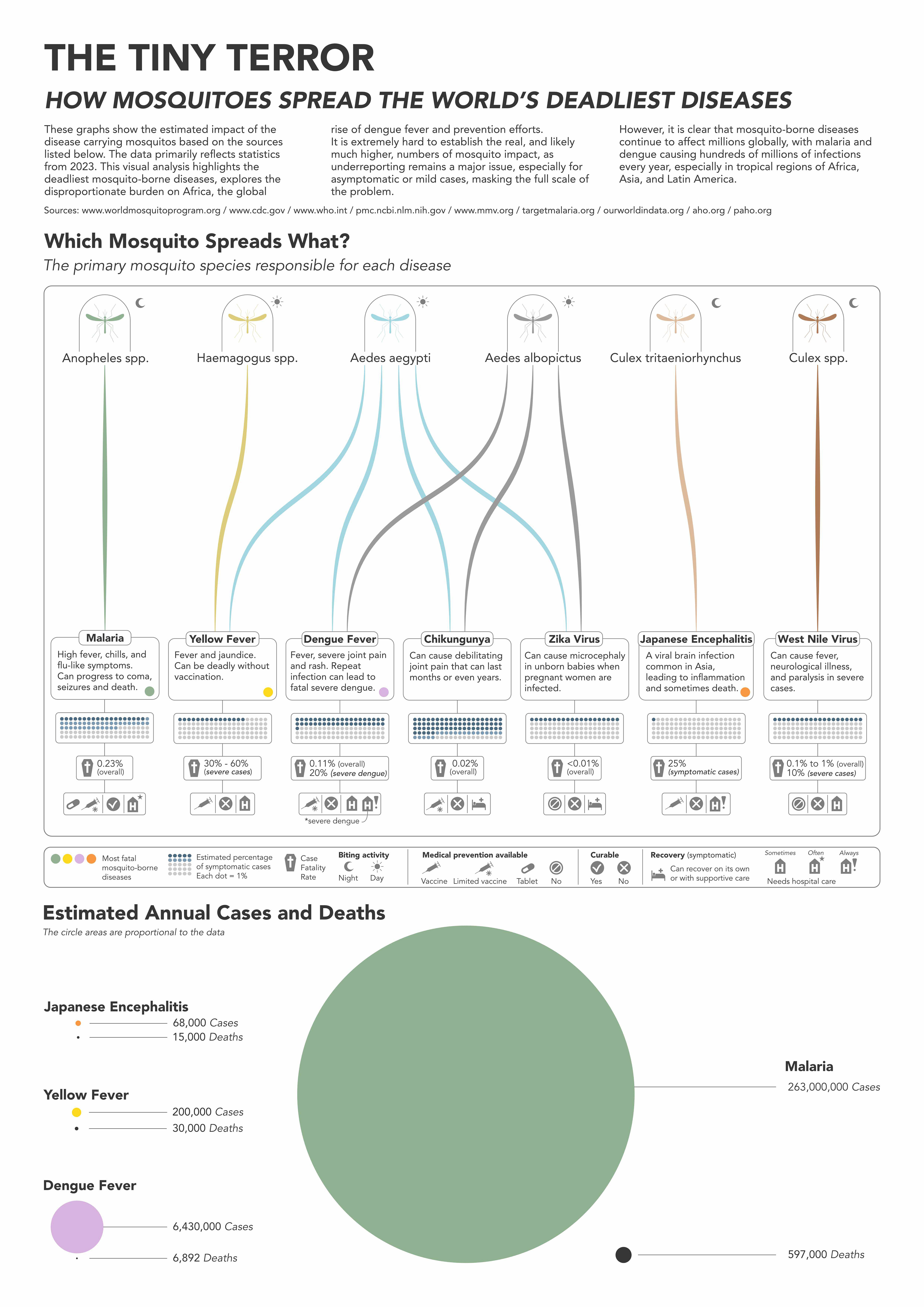
Having known people who suffered from Malaria and Dengue Fever, I decided to look at the global impact of mosquito-borne diseases.
It takes just one bite from this annoying, but seemingly innocent, insect to cause serious lasting consequences. Even though the death rate is a low percentage of total infections, the extremely high number of cases results in around 700,000 annual deaths, with some sources estimating the number to be over 1 million.
My goal was to tell a clear and cohesive story on mosquito-borne diseases, out of scattered and disconnected information that had to be condensed and presented in a way that was easy for anyone to understand.
Sources document
Design choices
- My aim was to create a single visual to show which mosquito species are responsible for which diseases. The layout and colour coded lines make it easy to follow the connections. I used a simple grid structure and a set of clear icons so the different diseases can be compared quickly, such as their symptoms, whether there’s a vaccine available and the severity of each.
- With that information in mind, I decided to focus on comparing the number of cases and deaths among the four most deadly diseases. I chose the circle packing chart to visualise the large difference between them. I found that the visual showing volume was a more powerful way to communicate the dramatic scale of Malaria.
The chart was created using RAWGraphs making sure that the area of each circle is mathematically
proportional to the case numbers, maintaining data integrity while prioritising the visual impact of the story.
A standard bar chart would have made the diseases with smaller values disappear next to malaria, so I considered using a logarithmic axis, but I found that it did not effectively convey the magnitude of the malaria problem compared to the other diseases.
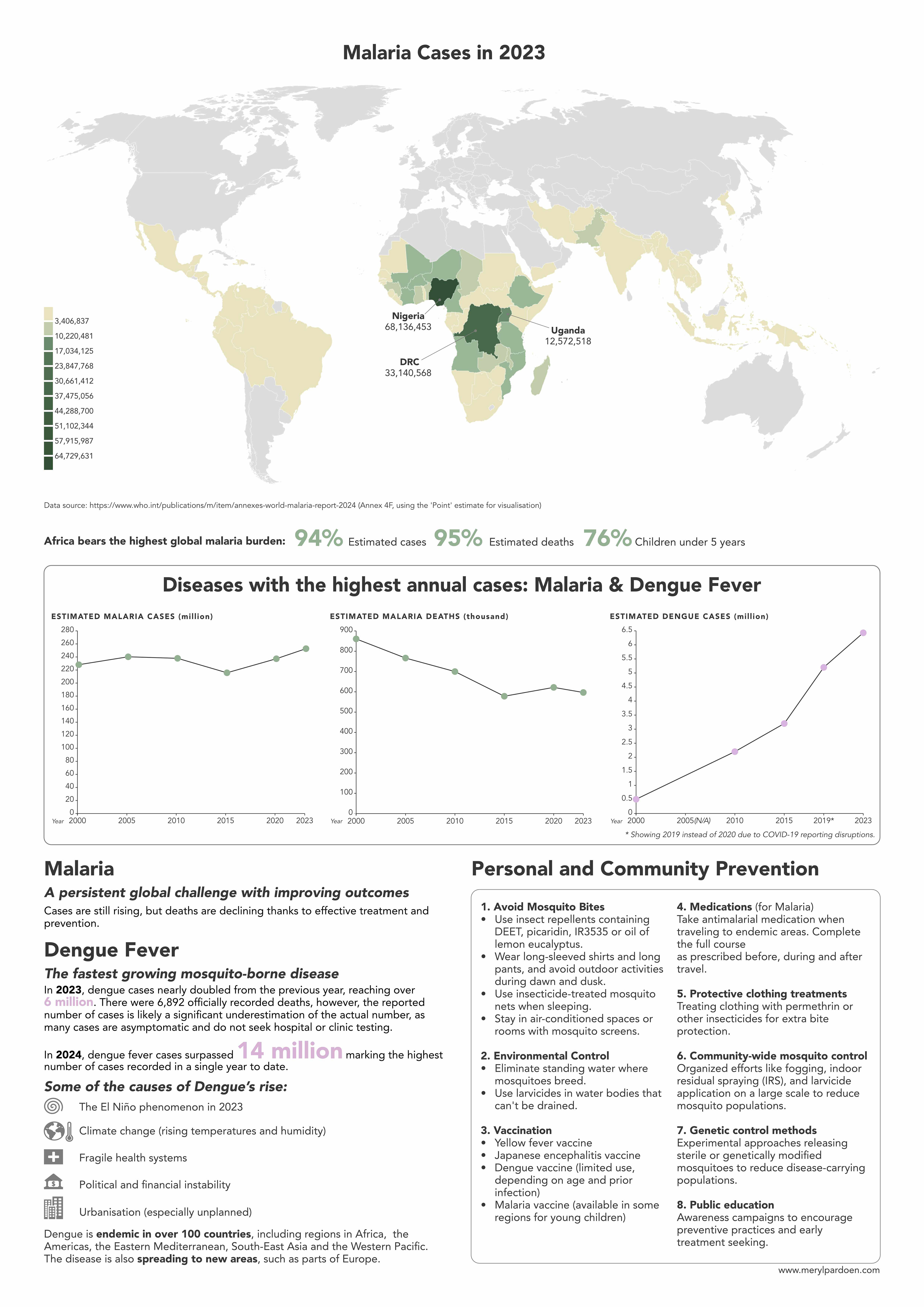
- To visualise the geographic impact of malaria a choropleth map was used, showing how far the disease spreads and which countries are affected the most.
- To compare the two current diseases with the biggest global impact over time, I chose line charts to show the decrease in malaria deaths and sharp increase of dengue cases.
Software used: Affinity Designer, RAWGraphs, Datawrapper, Excel