As more people turn to dairy alternatives, I wanted to visually compare their environmental footprint, using data sourced from Our World in Data. This project breaks down the numbers for dairy and several plant-based milks across key metrics for a comparison of their impact.
The goal was to visualise this in a way that is clear and engaging for a general audience. To make the information more approachable and fun, I decided to illustrate milk cartons (I used SketchUp to make a 3D model at the right angle, then drew the milk carton in Affinity Designer).
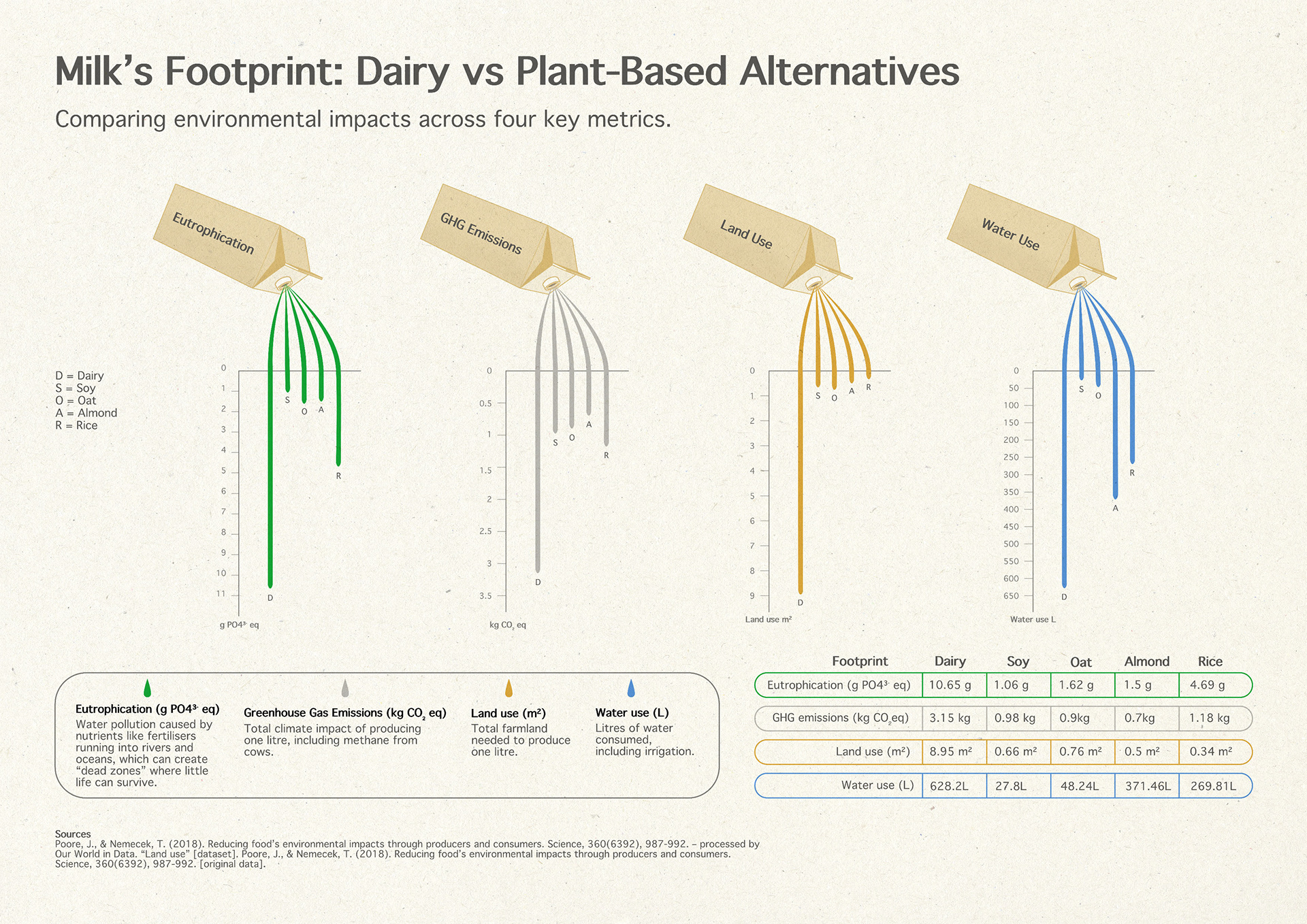
Software used: RAWGraphs, Affinity Designer, Photoshop