Client
Reuben Avenue
Brief
Design a sophisticated, memorable logo for Reuben Avenue, a gender-neutral, fully sustainable fashion label.
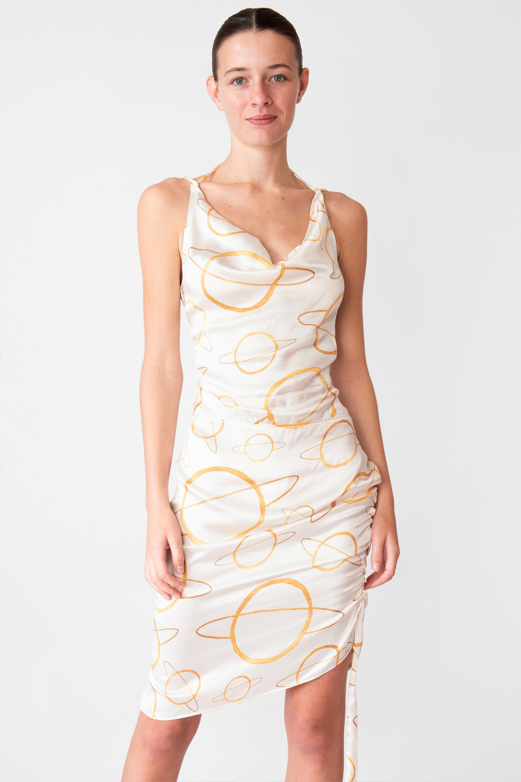
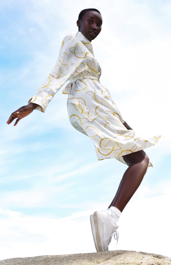
The main requirements were a high-end aesthetic and the incorporation of a planet image. Additionally, I was requested to develop a signature print, based on the logo, to complement their collection of solid coloured garments.
Role
Logo Design & Signature Print Development

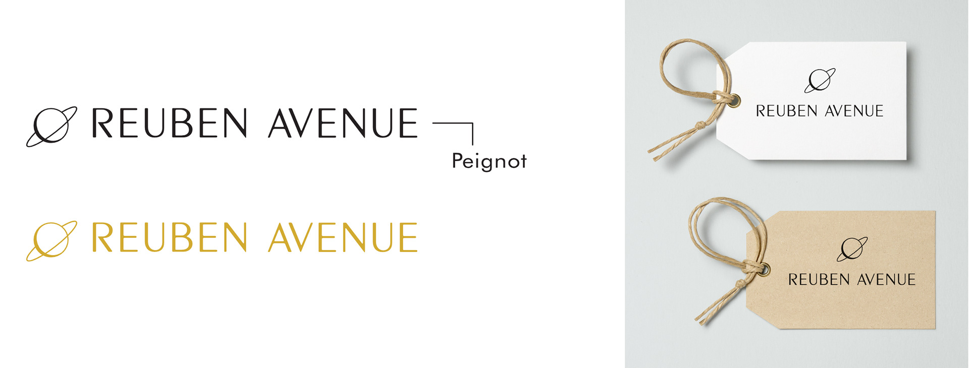
I designed the logo using a refined and elegant sans-serif typeface to convey a sense of modern luxury and timeless style, which aligns with the brand's premium positioning.
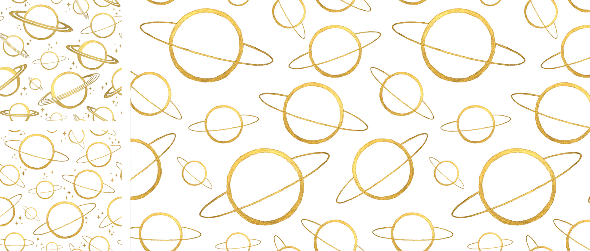
The core of the logo is the planet icon. I developed a minimal, linear illustration of a planet and the subtle shading details within the icon were added to give it depth and a more premium feel.
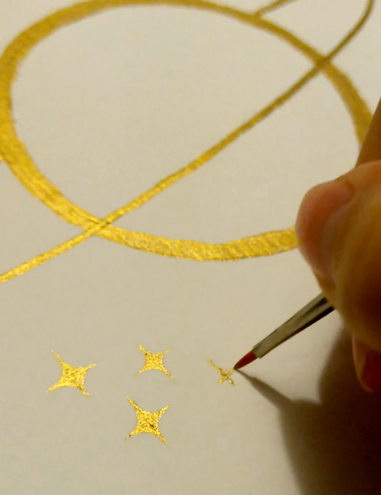
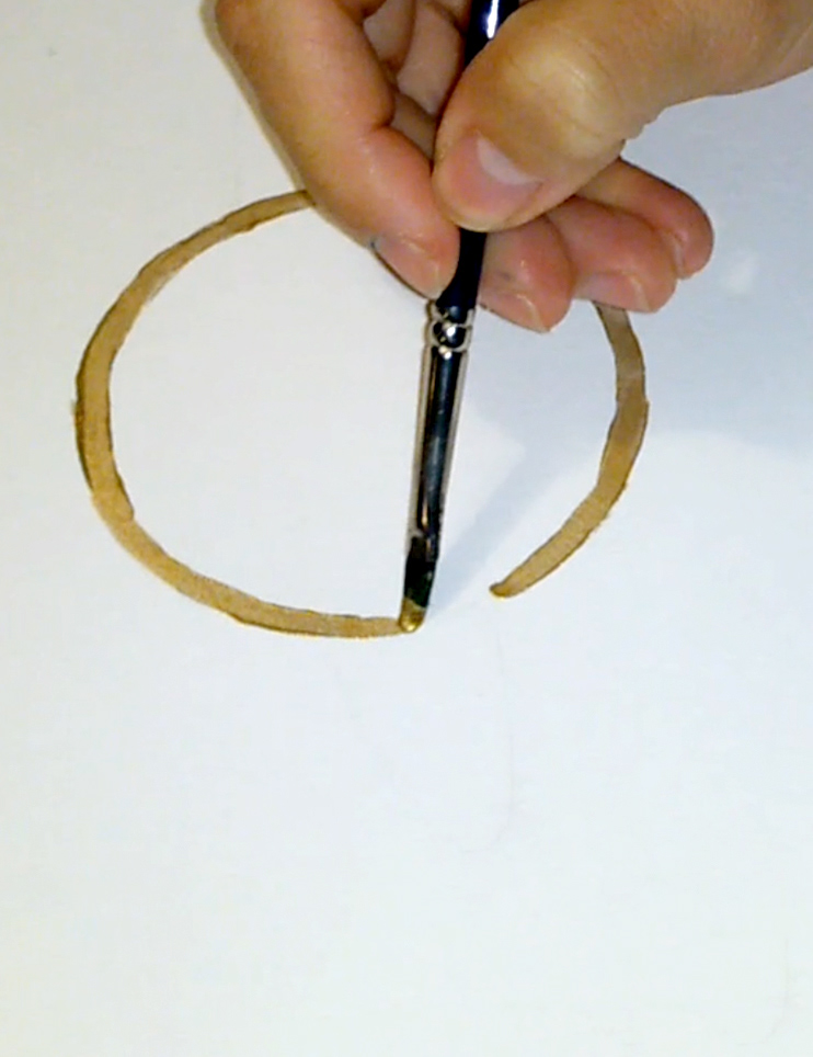
Building on the logo, I developed a signature print design to complement the brand's collection of solid coloured garments. The planet print was hand painted with gold paint, to give it a more whimsical and organic feel, in contrast to the polished logo. To complement Reuben Avenue's commitment to using only natural fibers and materials, I chose to give the motifs a more handcrafted and natural finish.
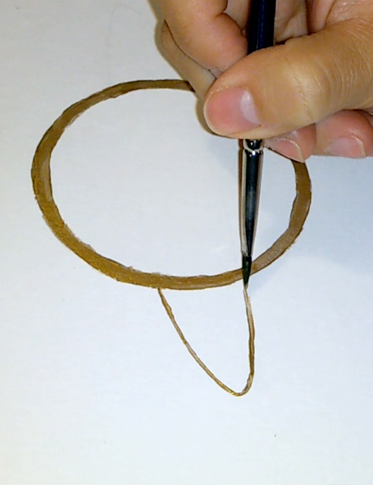
Instead of scanning, I decided to photograph the painted motifs to better capture the dynamic shine and texture and to avoid a flat look.

The first drafts were more decorative and detailed with a variety of planets and stars.
The client decided on a more minimal design with only a singular planet motif and no stars, so I took away the other variations and repeated the same planet in different sizes.
This collection was later repurposed and previous samples and dead stock was used to create new garments. These were one-of items hand made in Dublin by @louiseagh_.