Client
Jen Surma
Brief
Create a strong visual identity for Jen Surma, a naturally reserved copywriter and copy editor, to stand out professionally in the outdoor industry. The brand needs to feel confident and authentic to her personality while reflecting Jen's strategic "Dot Connecting Method" and feeling clean, modern and timeless.
Role
Brand Identity, Logo
For this project, the goal was to create a confident and professional visual identity. The challenge was to develop a brand that was not only memorable but also versatile and easy to apply consistently across all of her materials.
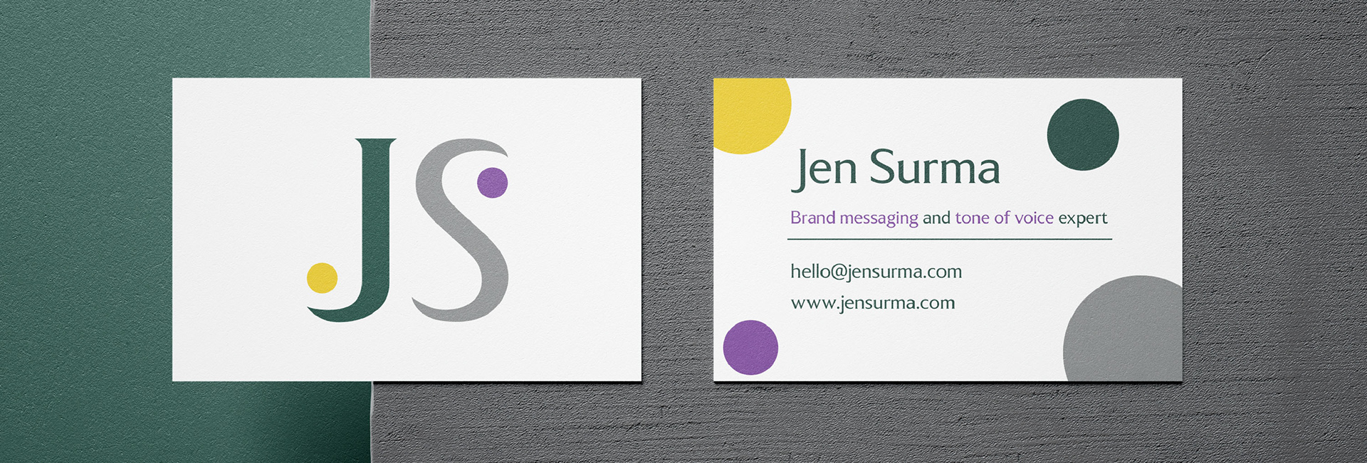
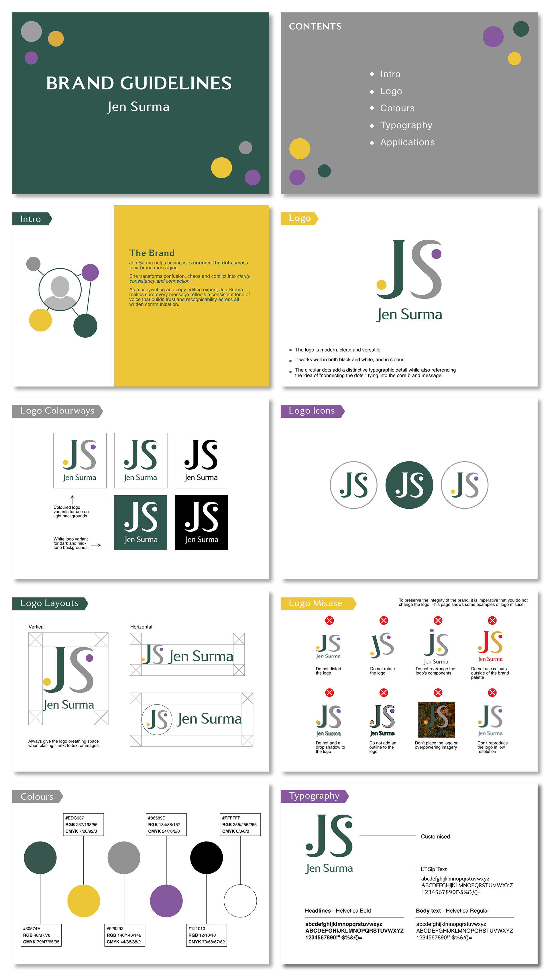
My process began by first understanding Jen's brand and her values. From there, I developed a visual system that would represent her identity. The centerpiece of the brand is a simple, modern monogram logo using her initials, "JS."
I created a versatile colour palette that combines a professional, sophisticated feel with a pop of energy. The deep green and purple, along with a neutral grey, provide a solid foundation, while the bright yellow adds a creative and vibrant touch. I also selected a clean, modern typography pairing to ensure all of her communications are clear and consistent.
The final deliverable was this comprehensive brand guidelines document. It's designed to be a clear reference for Jen, showing her everything from logo usage and colour variations to typography rules. This document ensures that her brand will remain consistent and professional wherever it's applied, from her website to her business cards, which I also mocked up to show the brand in the real world.